

Every business owner knows they need a website, so it’s easy to task it out to the first person who offers to do it for free- your uncle, your assistant, or even your kid. Once it does get built, it can easily sit on the back burner. If your website hasn’t been updated in awhile, take a look from the perspective of a customer. What issues below are sending the wrong message?
A note about web design trends
Many of these items reference web design trends that have passed. Now, I’m not all about following a trend just to fit in. The reason behind the trend is important. Features like navigation location, mobile responsiveness, and buttons are “trendy” because research shows that they convert visitors into customers. You probably update your products and services to reflect better ways of meeting customer needs. Why wouldn’t you do the same with your website?
Issues that can stop of slow down customer conversions on your business website:
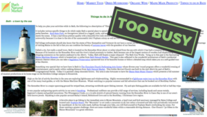
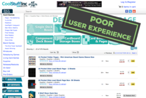
1. Your homepage is busier than a Denny’s menu
Having a visually pleasing homepage with high quality images and lot of whitespace is all the rage now. The whitespace helps you show your website visitors the actions you want them to take. They’re not inundated by 3 columns of content, and can move through your carefully-planned user flow to get the information they need to (hopefully) take action.
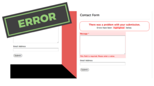
2. An important feature is broken
If the site was updated, it’s possible that the code or plugin behind the feature is outdated. It’s infuriating to spend time filling out a form, only to get your entry deleted and a big error message. At the very least, disable this page so users don’t get a 404 error. But a better plan is to think about what this feature offered your users. Were they taking advantage of it, and does it still help your bottom line? Businesses change and your website should change with it.
3. There’s music playing in the background
When technology first started allowing the automatic playing of a song when a page loaded, we marveled at any site that featured it. Now it’s a dead giveaway that the site is old. If the site is old, what’s there to tell visitors that you adapt to the times and can solve their problems now and in the future?
If you want a good laugh, check out this Polish Grill website.
4. Terrible stock photos
We all know a stock photo when we see it. A women in a double-breasted business suit shaking hands- obviously elated that the business deal has closed. A boss looking disapprovingly at a report, brows furrowed. There are so many good resources for great (even free!) images, that there’s no excuse anymore. Invite your audience to connect with your brand with images that beautifully speak to their emotions. Even better: hire a local professional photographer to deliver amazing custom photography for your marketing materials. Your customers will notice the difference.

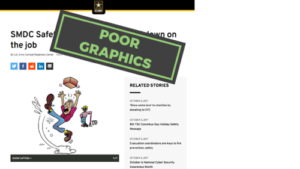
5. Graphics from the 80s
You want your visitors to associate you with the quality of work you do, not a cartoon from the last century. There are great resources for modern icons and images (many of them free!) so there’s no excuse for poor visuals.

6. The wrong kind of animation
Don’t get me wrong, lots of sites use animation correctly- a “Purchase Now” button that wiggles just enough to draw your attention, or a mouse-over that quickly flips to an image. These effects work because they draw the visitor’s eye at exactly the right time, and in the right place. Tons of animation is distracting, and make your content fall into second place. Let your content be the superstar.
Check out the subscription bar at the top of Neil Patel’s site for an example of how to do animation right.
7. No user experience planning
Many people build sites by simply using a template and filling in the content and images that apply to their business. Sure, the website may look great, but does the visit result in a sale or lead? Website builds should begin with a good look at the exact actions a business wants a potential customer to take. Do you want to get in touch with leads? Do you want to sell a product on the spot? People have a limited amount of time and get distracted easily. You must show and tell them the action you want them to take. This starts with great navigation and page layout, and can include good calls-to-action buttons. There shouldn’t be any friction between what your website visitor wants to accomplish and making it happen on your site.
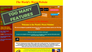
8. Too many features
This goes along with Number 7 on my list. Having features like a video or Instagram feed is fun. But if they’re interfering with the end goal, ditch ’em. You can always create a separate page with its own goals to showcase your video.
9. No website analytics
If you can’t see how users are interacting on your website, you can’t make it better. By hooking up Google Analytics, a free feature from Google, you can see audience demographics, how they navigate your site, and how long they look at your content, plus SO MUCH MORE. By viewing these results, you can rewrite a page that people exit from, or add content that appeals to a certain demographic. If you’re not measuring it, you can’t improve.

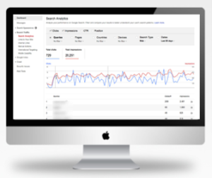
10. No search console results
Just like Google Analytics, Google Search Console is a free report that tells you what people search for to get to your site. By analyzing this data, you can create better content based on keywords.
Your business website is a marketing investment. For many customers, it’s the first touchpoint they get when searching for a local business that offers what you do. You dress the part, offer amazing customer service, and provide a product or service that impresses. Why would you be satisfied with a website that doesn’t offer the same?
My name is Jahana, and I do web design and digital marketing for local businesses in Springfield, Mo. If your website isn’t making a great first impression, call me (417.986.4373) or click below to set up a free Strategy Meeting. I’d love to get to know you and provide you with an exceptional online presence for your customers.